USMNT Badge History: The Story, Meaning, and Evolution Behind the U.S. Soccer Crest
USMNT Badge History
The badge on a national-team jersey is more than a logo. It is a visual shorthand for a country’s soccer history, identity, and ambitions. For the United States men’s national team, that identity has changed considerably over the decades.
So, what’s the history behind the USMNT badge?
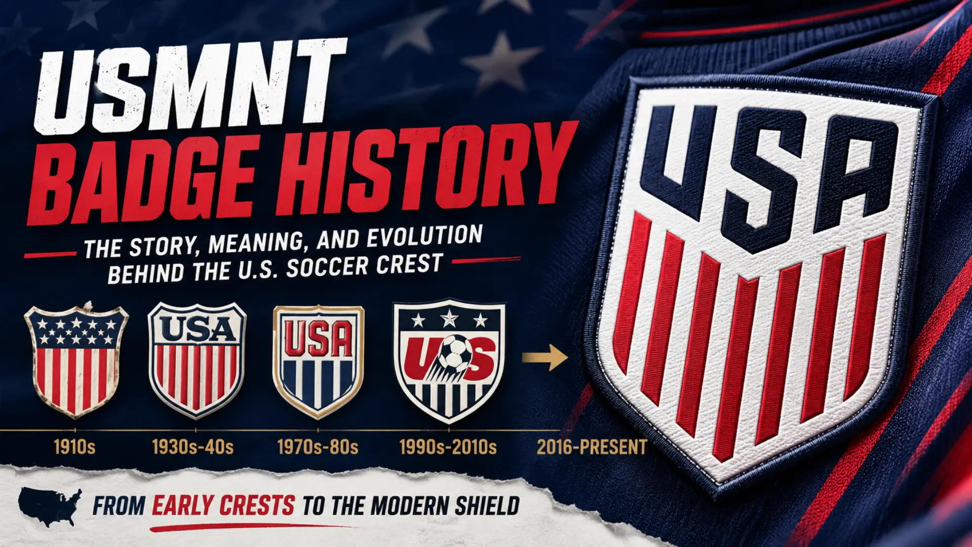
The modern crest is relatively simple: a shield, the word USA, and red-and-white stripes. But getting to that design took more than a century of changes in U.S. Soccer’s visual identity. The federation was founded in 1913, and historical records show that early U.S. teams used designs closely connected to the American flag before moving through a succession of different crests and logos.
The biggest modern transformation came in 2016, when U.S. Soccer replaced its long-running previous logo with the streamlined shield that remains associated with the national teams today.
What Is the USMNT Badge?
The badge worn by the United States men’s national team is fundamentally the crest of U.S. Soccer, the governing federation for soccer in the United States. The current design was introduced in 2016.
Its basic visual structure is straightforward:
- A shield-shaped outline
- USA displayed prominently across the upper portion
- Red-and-white vertical stripes
- A dark blue/navy color associated with the American flag
- No soccer ball
- No decorative stars inside the crest
That simplicity is intentional. Rather than relying on a soccer ball or complicated symbolism to communicate the sport, the modern crest places national identity at the center.
The current U.S. Soccer website continues to use the shield identity across its organization and national-team platforms.
The Early Years of U.S. Soccer Crests
The 1913 Beginning
To understand the USMNT badge history, it helps to start with U.S. Soccer itself.
The organization was established on April 5, 1913, originally as the United States Football Association. Historical accounts describe the founding meeting in New York and the federation’s early development as part of the growth of organized soccer in the United States.
The earliest known visual identities were much closer to the country’s flag than to a modern sports logo. The early shield design essentially treated the American flag as the starting point for a national soccer emblem.
That approach made sense for an international team. The badge did not need to explain a complicated brand. Its job was to identify the team as American.
From Flag-Inspired Designs to Soccer Identity
Over the following decades, the U.S. Soccer identity changed repeatedly. Historical records of the team’s kits and crests show a variety of shield and emblem designs across the middle and later parts of the 20th century.
Some versions were heavily influenced by traditional heraldic shapes, while others were more closely tied to contemporary sports branding.
There was not one uninterrupted visual style. Instead, the crest evolved alongside U.S. Soccer’s changing place in the international game.
The Badge Evolution Through the 20th Century
Why the Crest Changed So Often
Unlike some national teams that maintained essentially the same emblem for generations, U.S. Soccer went through numerous visual changes.
Part of the reason was that American soccer itself was changing. The federation was developing its identity, the national teams were appearing in different international competitions, and sports branding was becoming increasingly important.
The surviving historical record includes multiple U.S. Soccer designs from different periods, including versions associated with the 1970s, 1980s and early 1990s.
This makes the USMNT badge history interesting because there is no single “original look” that simply evolved through small refinements. Instead, the federation experimented with different approaches before eventually settling into a much more recognizable modern identity.
The 1990s-Era U.S. Soccer Logo
One of the most recognizable older designs was the logo that dominated the 1990s and remained in use into the 2010s.
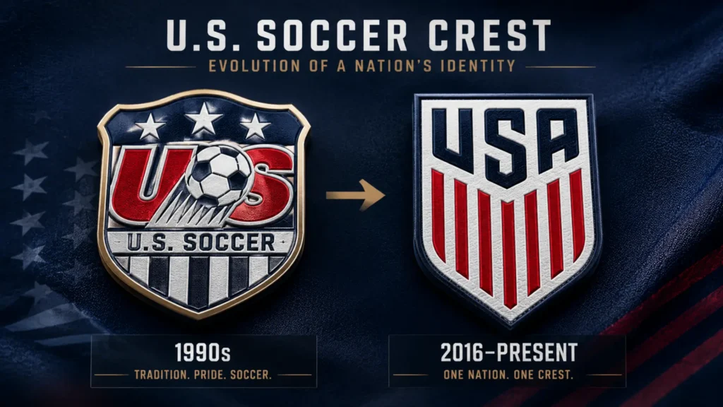
This version featured a rounded shield-like shape, prominent U.S. Soccer lettering, a stylized soccer ball and three stars. It was very different from today’s stripped-down design.
The three stars are particularly interesting because they can easily be mistaken for championship stars.
They were not a record of men’s World Cup victories. They were part of the graphic design of the old federation logo.
That distinction became increasingly relevant as the U.S. national teams developed stronger identities and fans began paying more attention to the meaning of the crest itself.
By the mid-2010s, the old design was more than two decades old, and U.S. Soccer decided that a major visual update was needed. ESPN reported in 2016 that the federation had unveiled a new crest for the first time in more than 20 years.
The 2013 Centennial Crest
Before the permanent redesign, U.S. Soccer briefly explored a very different visual direction during its centennial celebrations.
In 2013, U.S. Soccer celebrated its 100th anniversary with a special Centennial identity and kit. The design deliberately looked backward, drawing inspiration from early U.S. national-team uniforms and traditional American imagery.
The Centennial crest became popular among many supporters because it felt historical rather than futuristic. Its stars-and-stripes appearance connected directly to earlier American soccer imagery.
It was not, however, the federation’s permanent crest.
Instead, the Centennial period helped demonstrate that there was strong interest in a cleaner, more traditionally American visual identity.
The 2016 U.S. Soccer Crest Redesign
The defining moment in modern USMNT badge history came on February 29, 2016.
U.S. Soccer unveiled a completely redesigned crest, replacing the previous logo that had been around since the 1990s. The new design used a shield containing a bold USA wordmark above red-and-white stripes.
The change was significant because the new badge removed several elements associated with the old logo.
Gone were:
- The stylized soccer ball
- The three decorative stars
- The older, busier visual treatment
- The emphasis on the federation’s name within the badge
What remained was much simpler: USA + shield + American flag colors.
The new crest was unveiled through a fan-focused campaign, including a virtual-reality experience and social-media rollout involving U.S. national-team players and supporters.
What the Modern Shield Represents
The current badge can essentially be understood as an American flag translated into a soccer crest.
The shield provides a traditional national-team shape. The red-and-white stripes reference the stripes of the U.S. flag, while the navy and red palette reinforces the national identity.
The word USA makes the international purpose unmistakable.
This is an important change from the previous design. The badge no longer needs a soccer ball to tell viewers that it belongs to a soccer organization. The national identity itself has become the dominant feature.
Why the Soccer Ball and Three Stars Disappeared
The removal of the soccer ball was one of the most obvious differences between the old and new designs.
From a branding perspective, a soccer ball is a straightforward way to tell viewers what sport an organization represents. But it can also make a national federation crest feel more like a generic soccer logo.
The 2016 design moved in the opposite direction.
Instead of saying “American soccer” through several separate symbols, it effectively says “USA” first.
The three stars were also removed. Contemporary reporting and design coverage of the redesign noted that the new badge abandoned the older stars and soccer-ball imagery in favor of the simplified USA-and-stripes shield.
What Does the USMNT Badge Mean Today?
At its simplest, the current USMNT badge communicates three ideas:
USA: The national identity is immediately visible.
Red and white stripes: The design references the American flag.
Shield: The shape gives the mark the traditional appearance of a national emblem.
There is also an important distinction between the federation crest and the decorations that can appear around it on a national-team jersey.
The badge itself is not a scoreboard. It does not attempt to list every achievement in U.S. soccer history.
That makes the design relatively flexible. It can appear on the USMNT jersey, federation materials and other U.S. Soccer contexts without becoming tied to one specific tournament.
Why Does the USMNT Badge Have No Stars?
This is one of the most common questions about the American soccer crest.
The simplest answer is that the United States men’s national team has not won a FIFA World Cup, so there are no men’s World Cup championship stars to display.
The absence of stars should not be confused with the three stars that appeared in the older U.S. Soccer logo. Those were part of the previous graphic design rather than a count of World Cup titles.
The U.S. women’s national team is a different story. Its jerseys have featured four stars representing its four FIFA Women’s World Cup championships, won in 1991, 1999, 2015 and 2019.
The two teams can therefore use the same basic U.S. Soccer shield while having different star treatments on their jerseys.
How the Badge Became Part of USMNT Identity
A national-team badge gains meaning through repetition.
Players wear it when representing the country. Supporters see it on jerseys, scarves, flags, broadcasts and stadium displays. Over time, the design becomes connected to particular generations of players and memorable matches.
For fans who grew up watching the USMNT during the 1990s and 2000s, the older U.S. Soccer logo can evoke a very different era of American soccer.
For younger supporters, the 2016 shield is the familiar version.
That is why debates about the “best” USMNT badge are rarely just about graphic design. They are also about nostalgia, memories and how supporters experienced the national team during a particular period.
The 2016 crest has now been in use for a decade, making it one of the longest-running modern identities in U.S. Soccer’s history. Current U.S. Soccer materials continue to feature the same core shield identity.
Frequently Asked Questions
What’s the history behind the USMNT badge?
The USMNT badge has developed alongside U.S. Soccer since the federation’s founding in 1913. Early designs were strongly influenced by the American flag, while later decades brought several different shield and emblem styles. A major modern change came in 2016, when U.S. Soccer introduced the current shield featuring USA lettering and red-and-white stripes.
When did U.S. Soccer change its logo?
U.S. Soccer introduced its modern shield crest in 2016, replacing the long-running logo that had been used since the 1990s. The new design removed the soccer ball and three decorative stars and placed greater emphasis on the USA name and American flag-inspired stripes.
What do the stripes on the USMNT badge mean?
The red-and-white stripes are a direct visual reference to the stripes of the American flag. In the modern crest, those stripes occupy the lower portion of the shield beneath the bold USA wordmark.
Why doesn’t the USMNT badge have stars?
The current men’s crest does not have championship stars because the U.S. men’s national team has not won the FIFA World Cup. The three stars found on the older U.S. Soccer logo were decorative elements rather than a record of men’s World Cup victories.
Did the old U.S. Soccer logo have three stars?
Yes. The older logo used before the 2016 redesign included three stars alongside a stylized soccer ball. Those stars were graphic elements of the federation’s branding and should not be interpreted as three World Cup titles.
What was the 2013 Centennial crest?
The Centennial crest was a special identity created for U.S. Soccer’s 100th anniversary in 2013. Its design drew inspiration from historical U.S. national-team imagery and earlier American soccer uniforms. It was a commemorative design rather than the permanent replacement for the federation’s existing logo.
Is the 2016 U.S. Soccer crest still used?
Yes. The shield introduced in 2016 remains the core U.S. Soccer crest used across the federation and its national-team identity. Current U.S. Soccer materials continue to display the shield, including USMNT-related content.
Conclusion
The history of the USMNT badge mirrors the broader development of soccer in the United States. Early designs leaned heavily on the American flag, later versions experimented with different shield and sports-branding concepts, and the 1990s-era logo introduced the soccer ball and three decorative stars.
The 2013 Centennial crest briefly looked backward for inspiration. Then, in 2016, U.S. Soccer took a decisive step forward with a simpler identity built around USA, the shield and American flag colors.
That design has now become the familiar face of U.S. Soccer. Its simplicity is its defining feature: it does not try to tell the entire history of American soccer in one badge. Instead, it puts the country itself at the center.